
Brand Design Case Study
Back to Projects
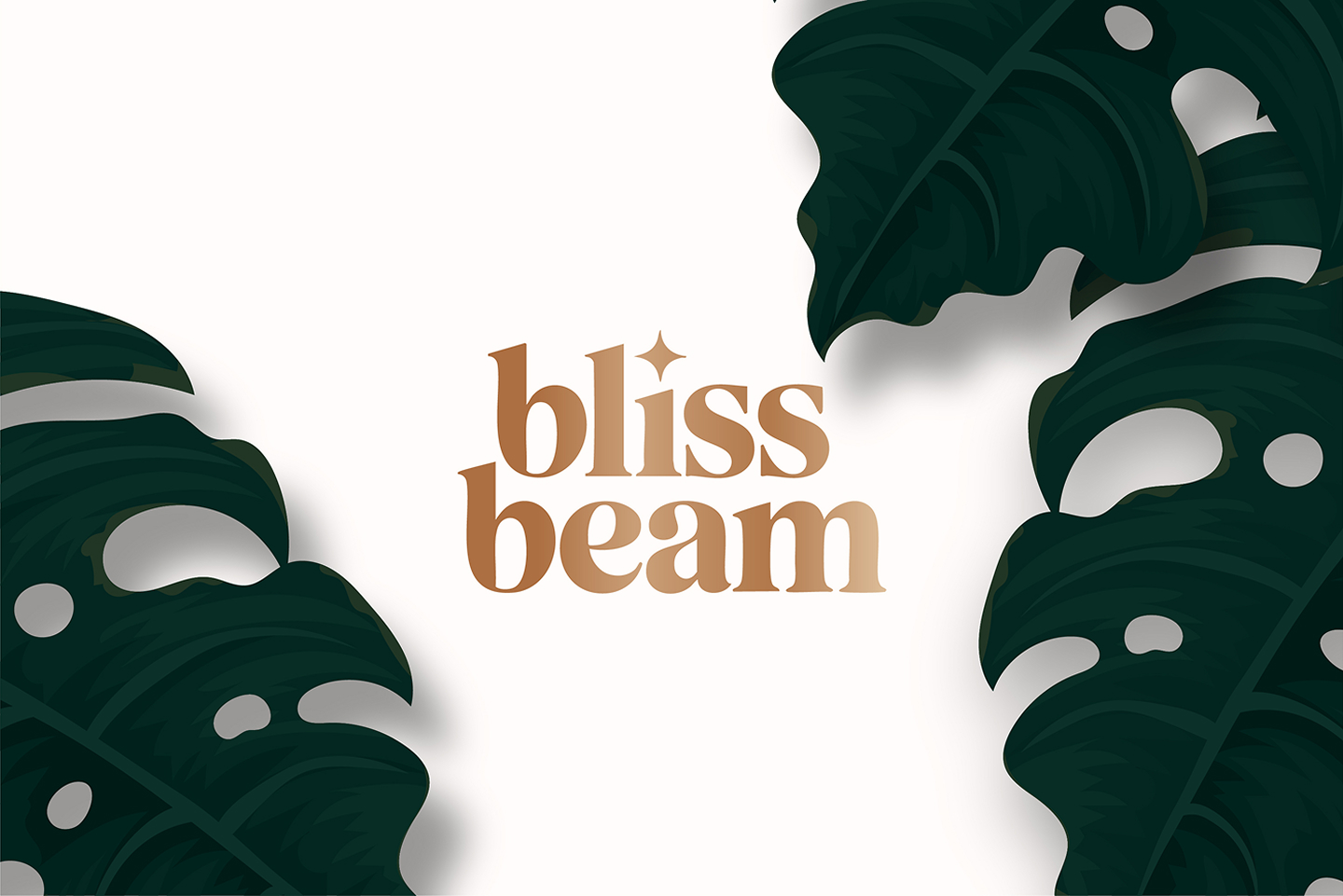
Blissbeam Skincare Identity
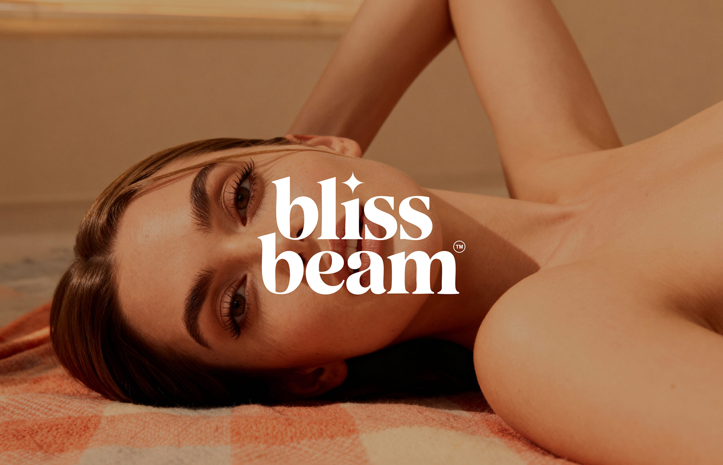
A comprehensive brand identity and premium packaging layout for a luxury skincare line rooted in botanical science. Balancing laboratory clean-trust with warm, organic feminine aesthetics.
Client
Blissbeam Organics
Timeline
4 Weeks
Role
Senior Brand & Visual Designer
Deliverables
Identity & Packaging
3
Brand directions
5
Color palettes
23
Packaging assets
Project timeline
Week 1
Week 2
Week 3
Week 4
Discovery & Competitor Audit
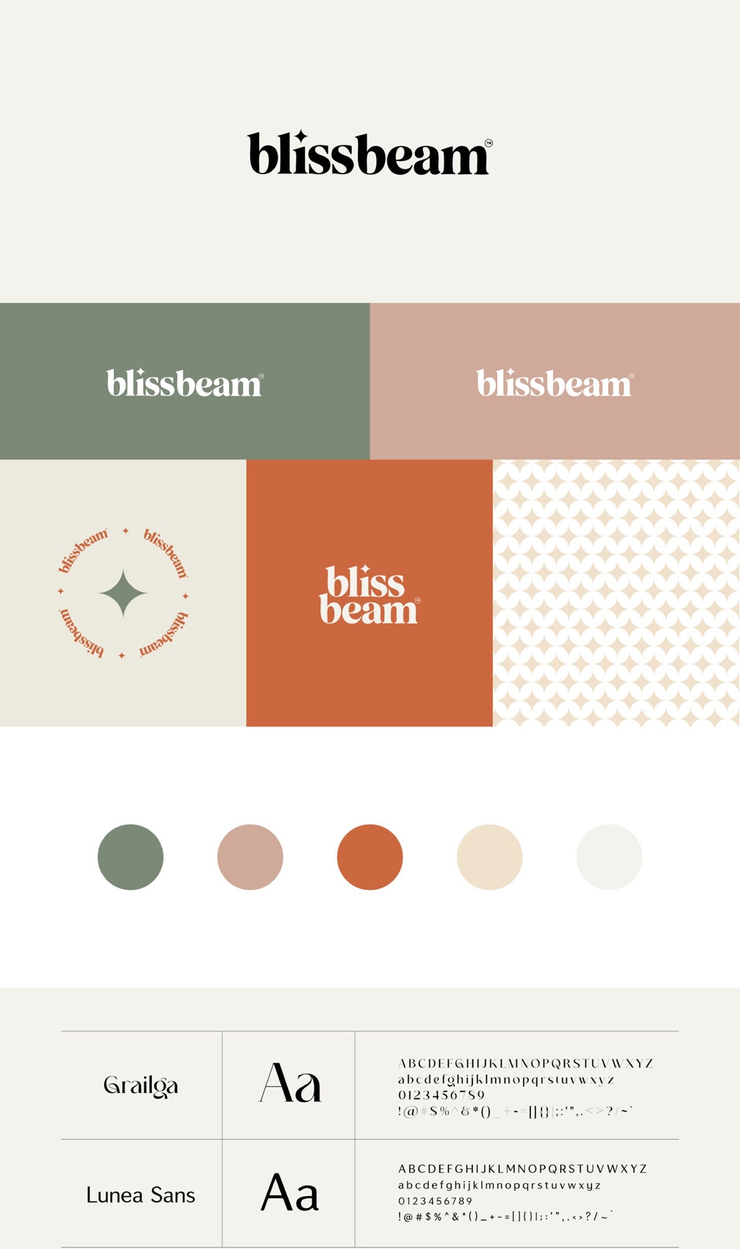
Serif Typography & Botanical Palette
Glassware & Dropper Bottle Labels
Outer Box Dielines & Print Proofs
Design Evolution
1
Week 1
•
Research & Tone
Auditing Minimalist Skincare Competitors
We conducted an extensive competitor audit of high-end skincare brands. Our goal was to strike a delicate balance: establishing clinical expertise and science-based trust while injecting organic, warm, and feminine skincare beauty.
Key Research Insight
"82% of premium skincare consumers associate minimal label designs with high ingredient quality and trustworthiness, but they require earthy warm tones to feel connected to organic origins."
2
Week 2
•
Visual Language
Curating Type Systems & Visual Identity
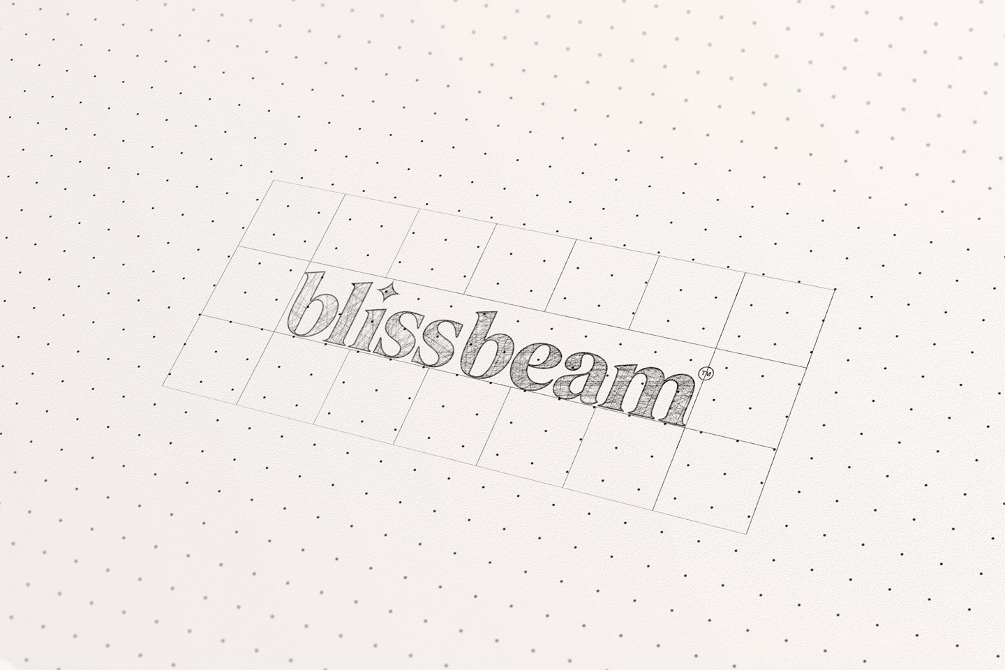
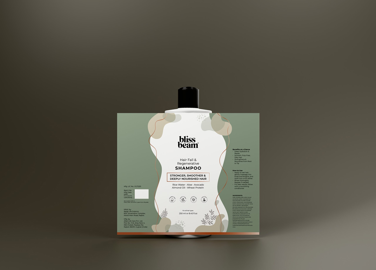
For the logo lockup and headers, we customized a high-contrast serif font style to represent heritage and botanical authority. For the secondary descriptions and body text, we paired it with a clean sans-serif layout to maintain clinical legibility.
3
Week 3
•
Product Packaging
Applying Layout Rules to Glassware & Outer Boxes
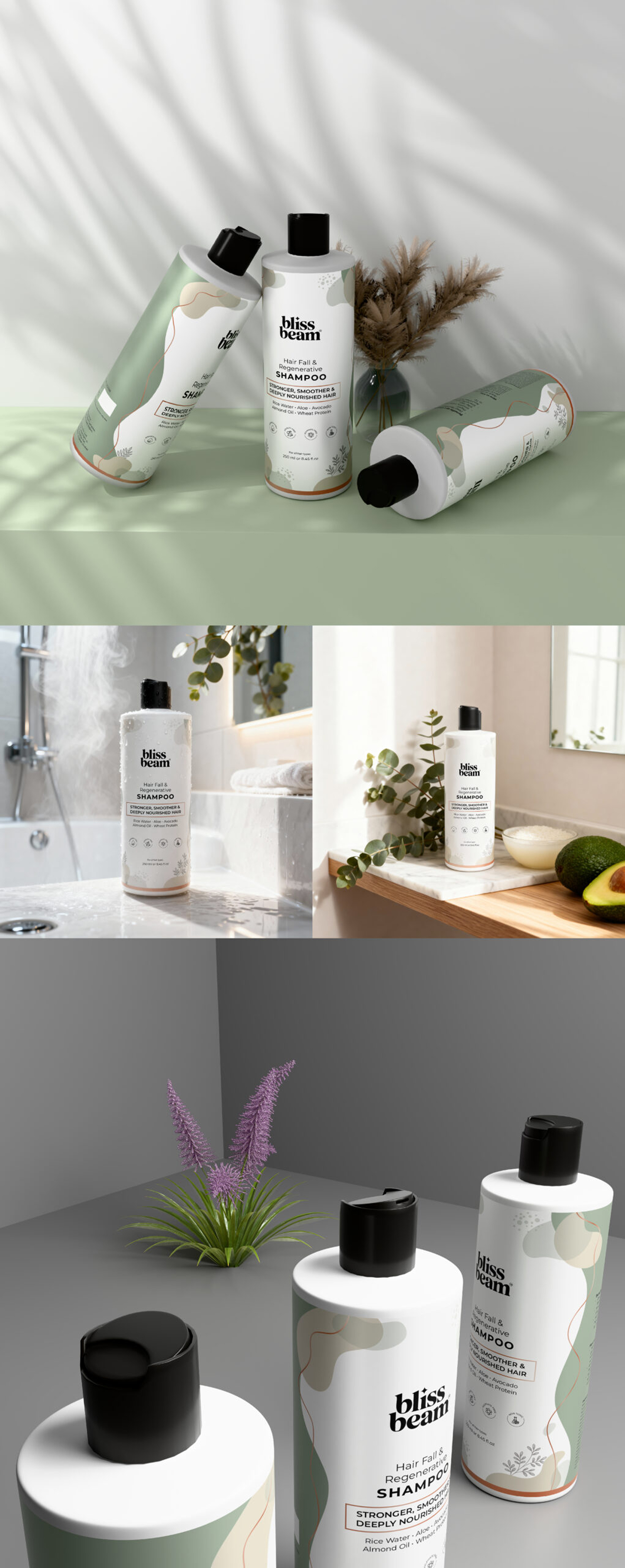
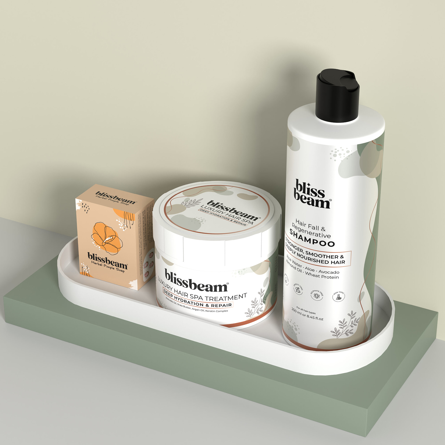
We crafted layout rules for custom packaging boxes, dropper bottles, jars, and stationery templates. By employing a clean vertical text grid alignment, we allowed the luxury brand ingredients to speak for themselves with maximum premium whitespace.
01 • Glassware
Dropper Bottles
Vertical grid typography, botanical ingredient hierarchy & frosted amber glass rules.
02 • Outer Boxes
Packaging Boxes
FSC certified rigid board with tactile terracotta embossing and minimalist label stamps.
03 • Cosmetic Jars
Cream & Salve Jars
Continuous 360-degree minimalist label wrapping with generous white space balance.
04 • Print Specs
Brand Guidelines
Production-ready dielines, ink formulation specs, and regulatory compliance standards.
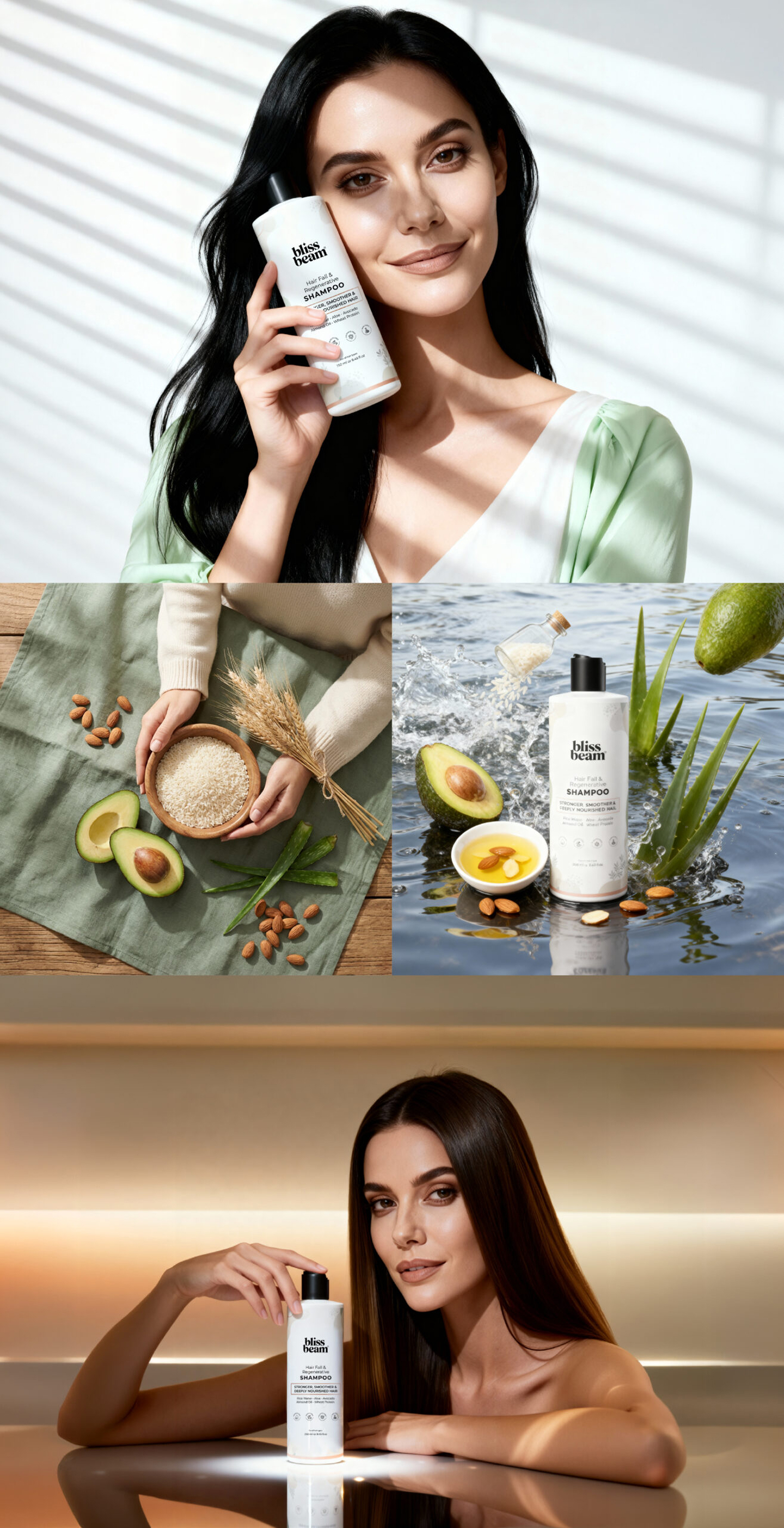
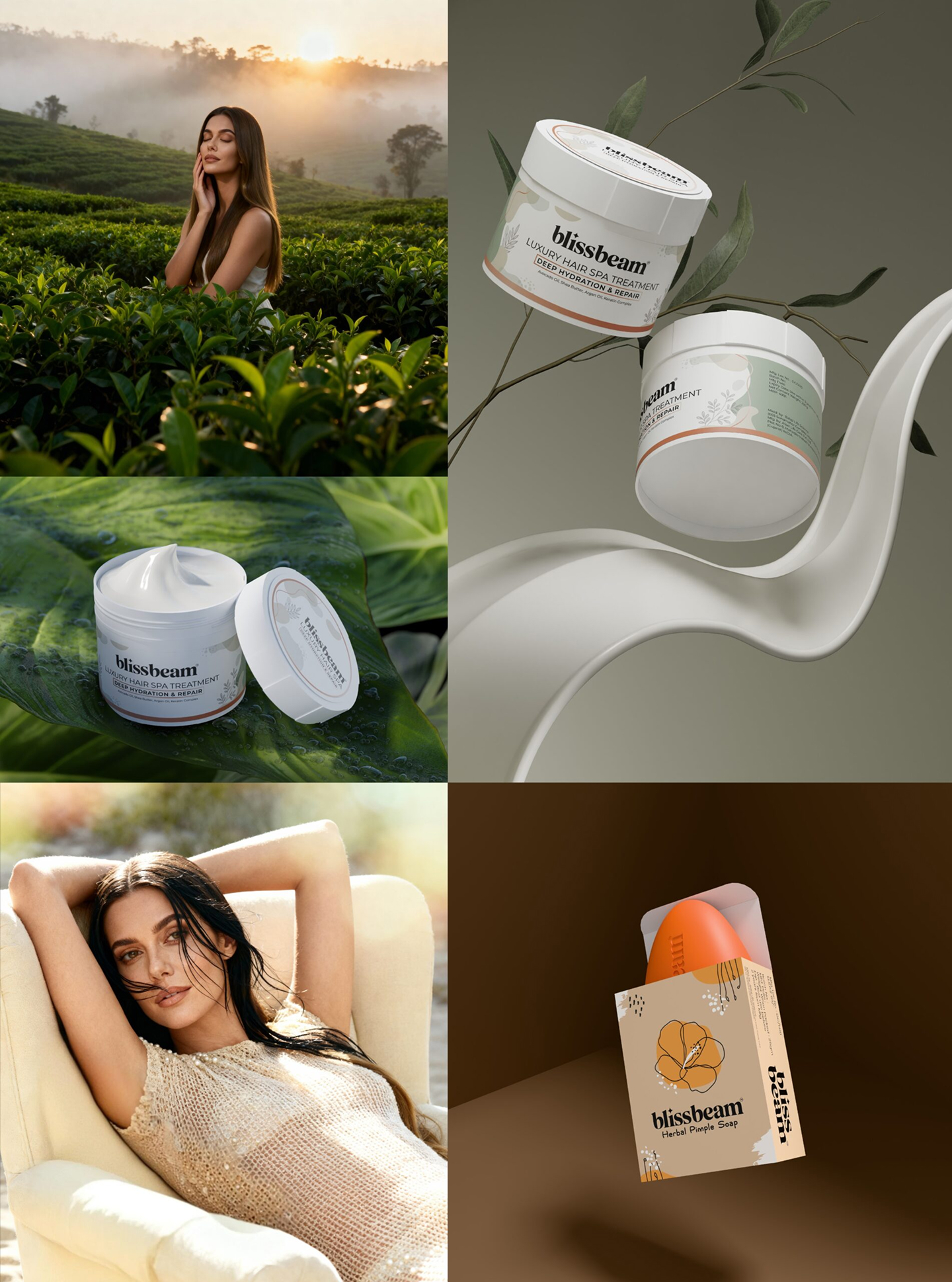
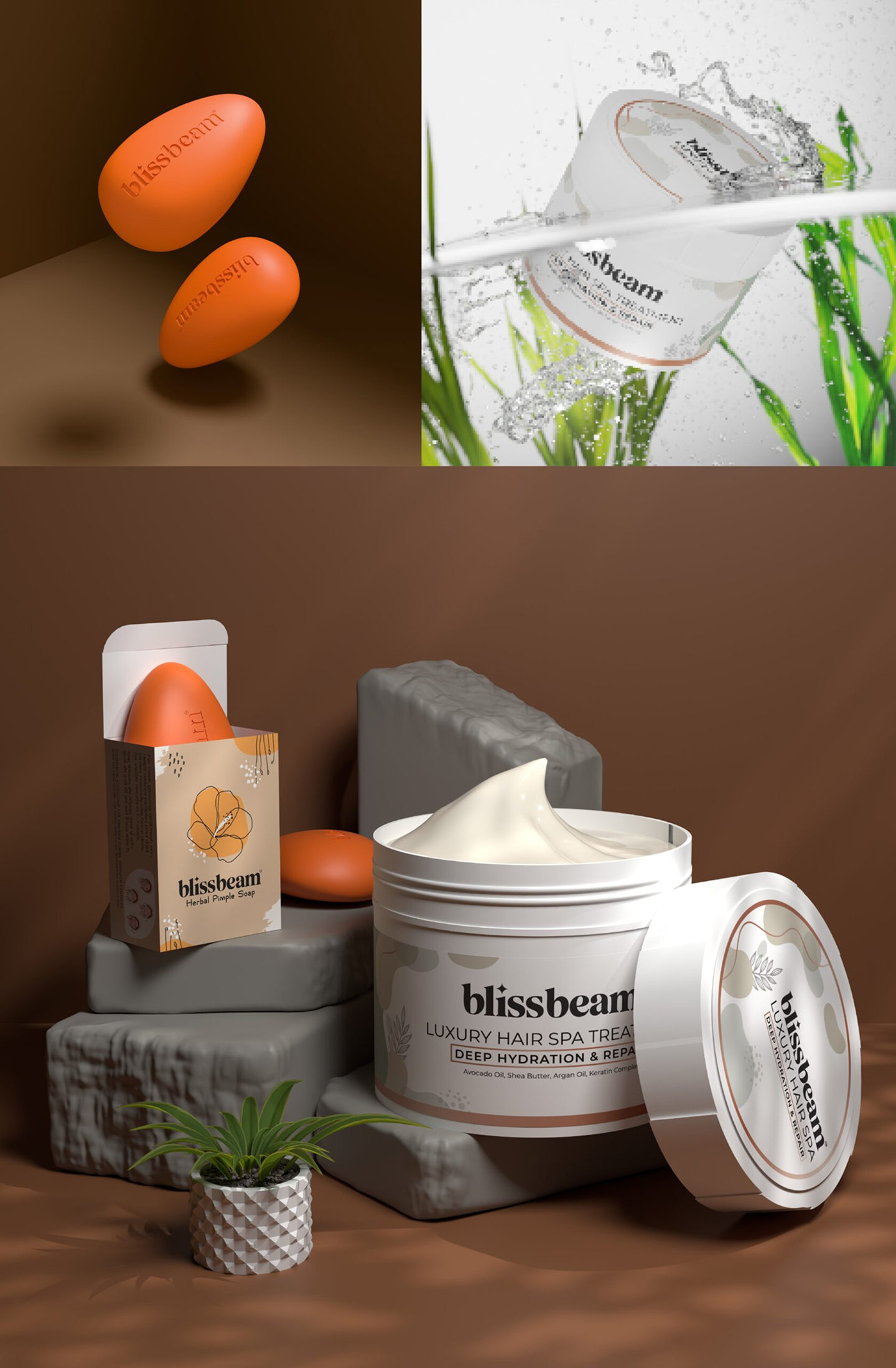
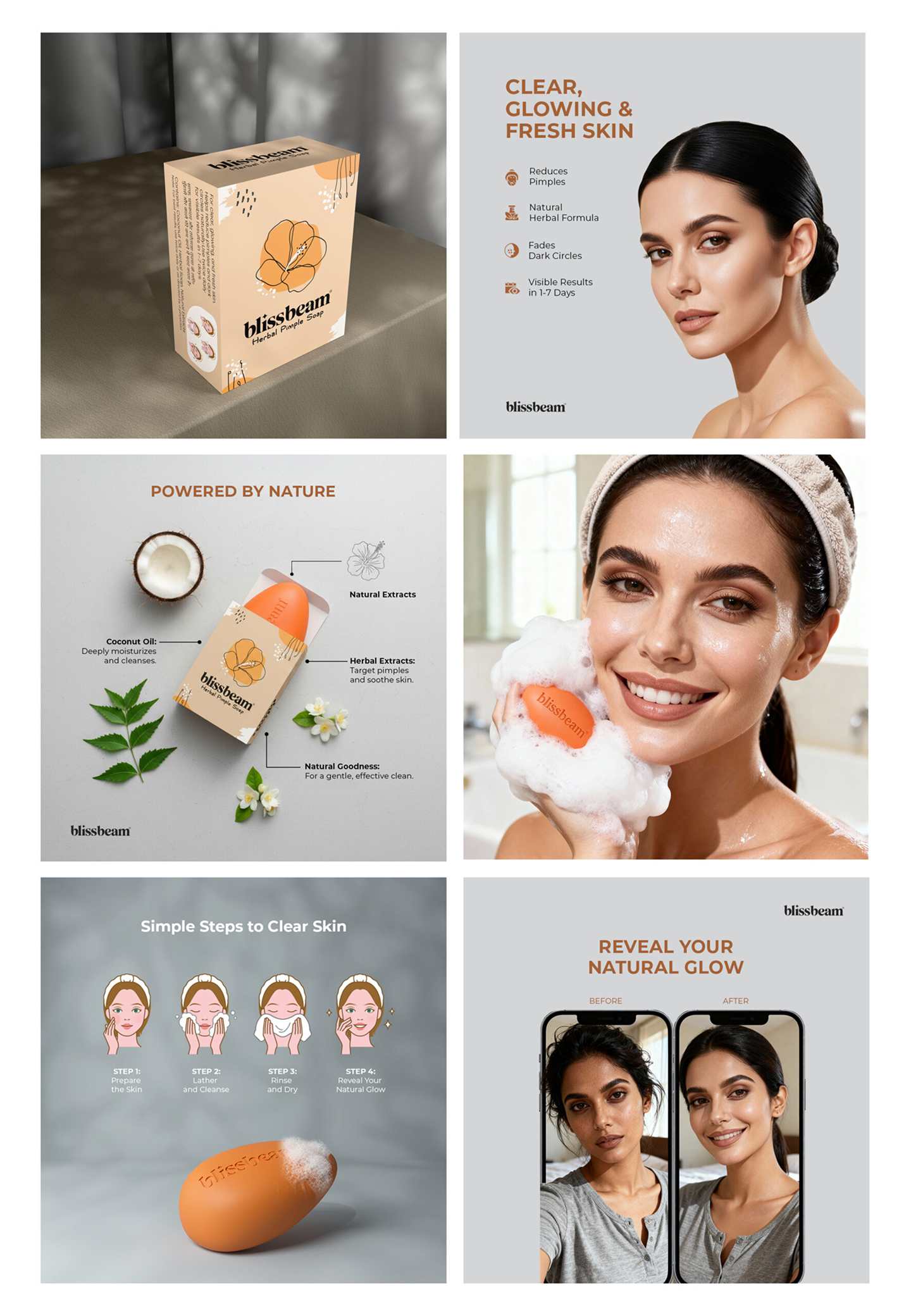
Showcase Collage
Visual Identity Assets
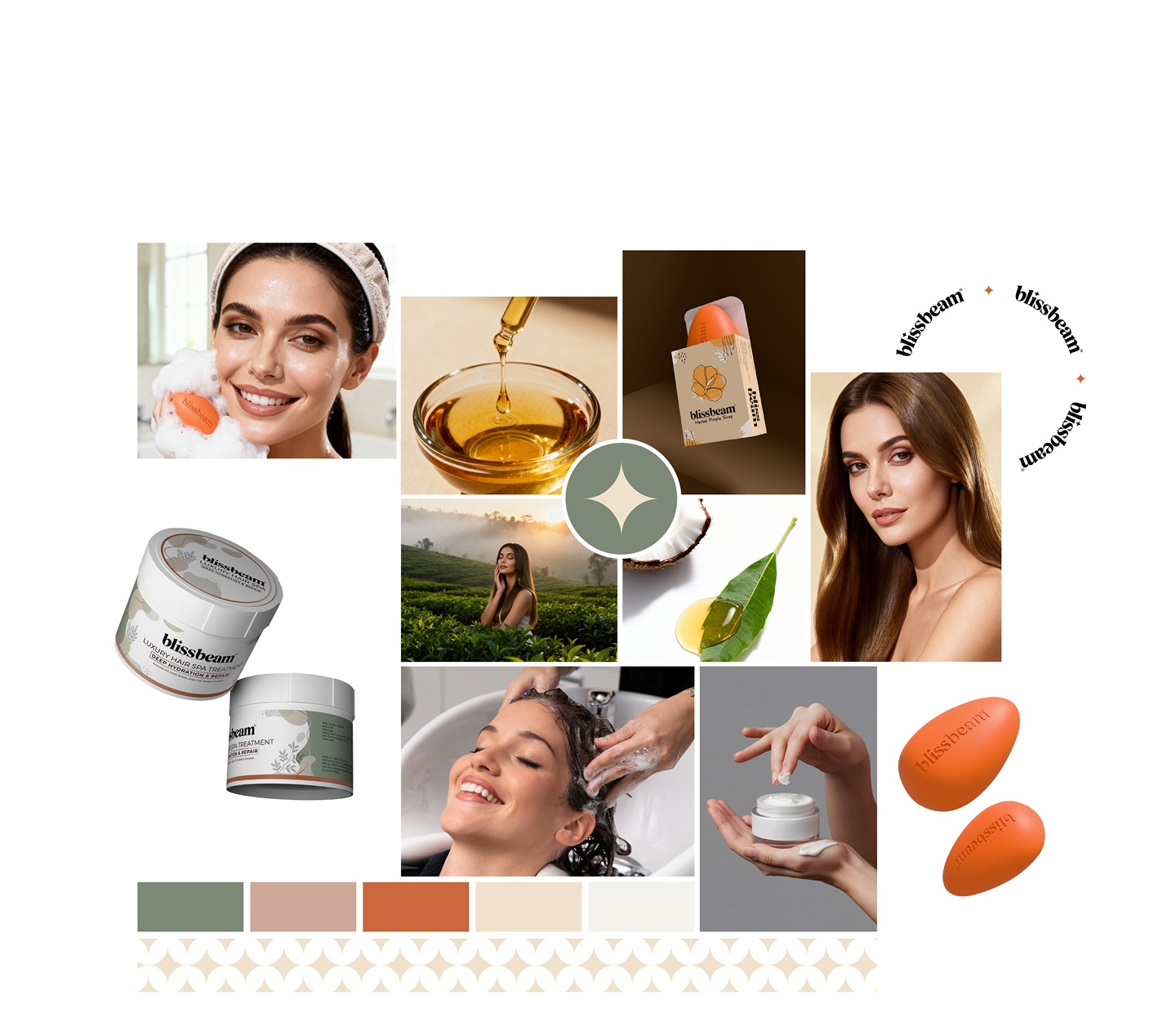
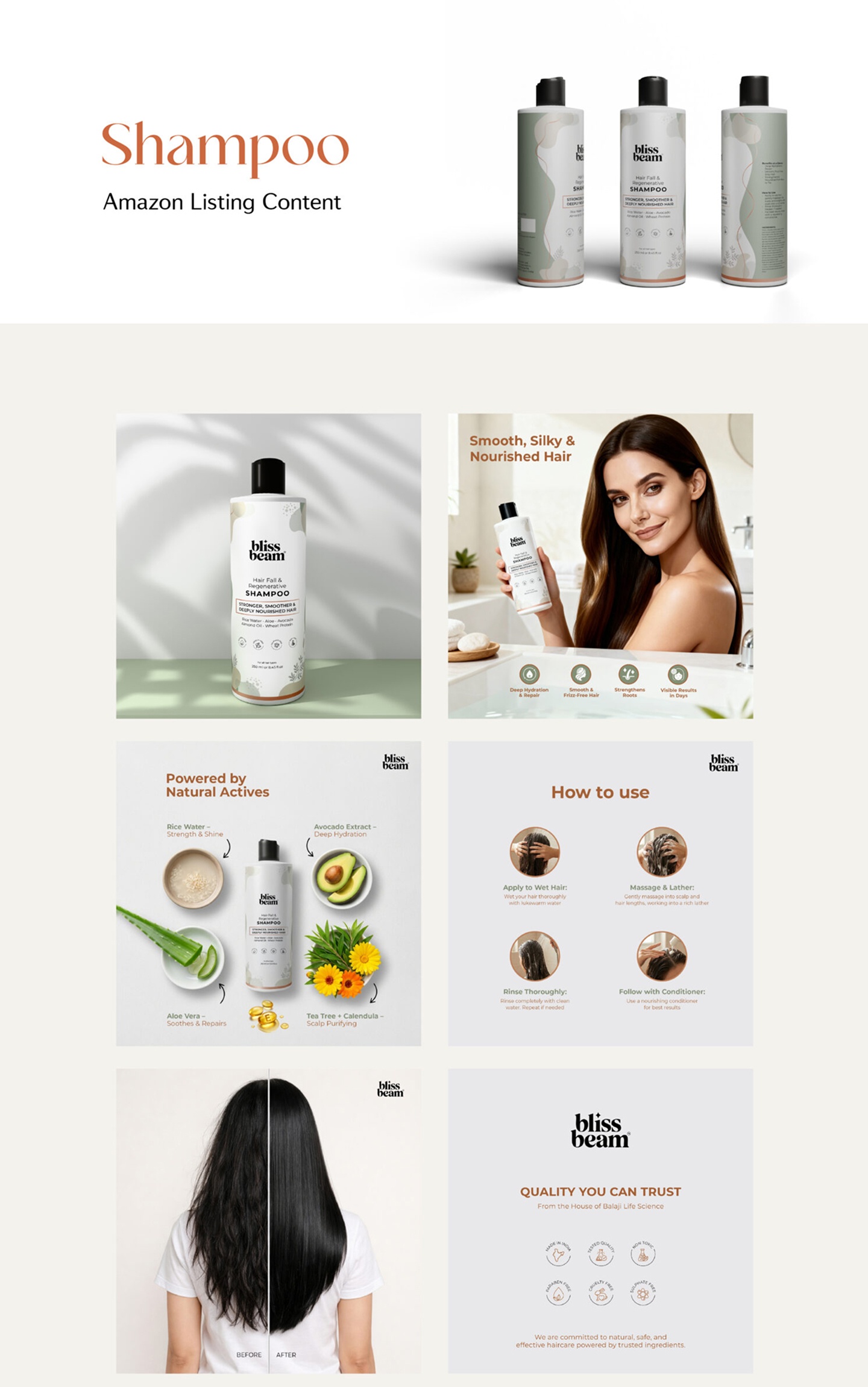
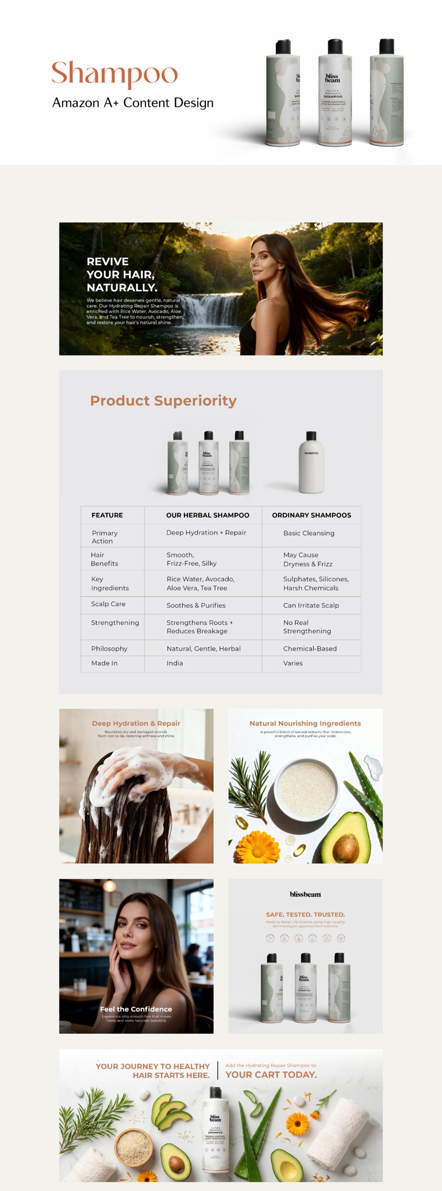
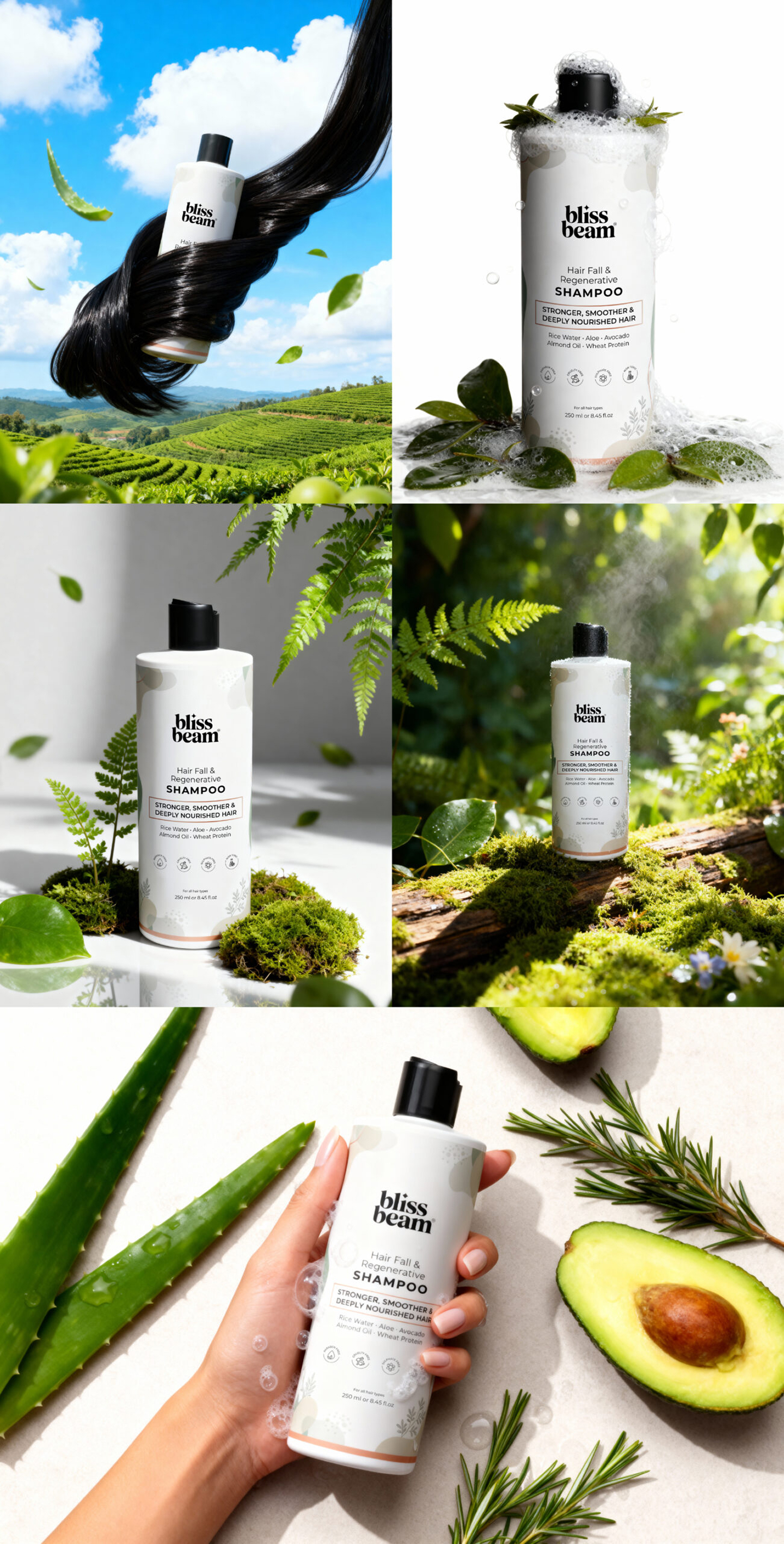
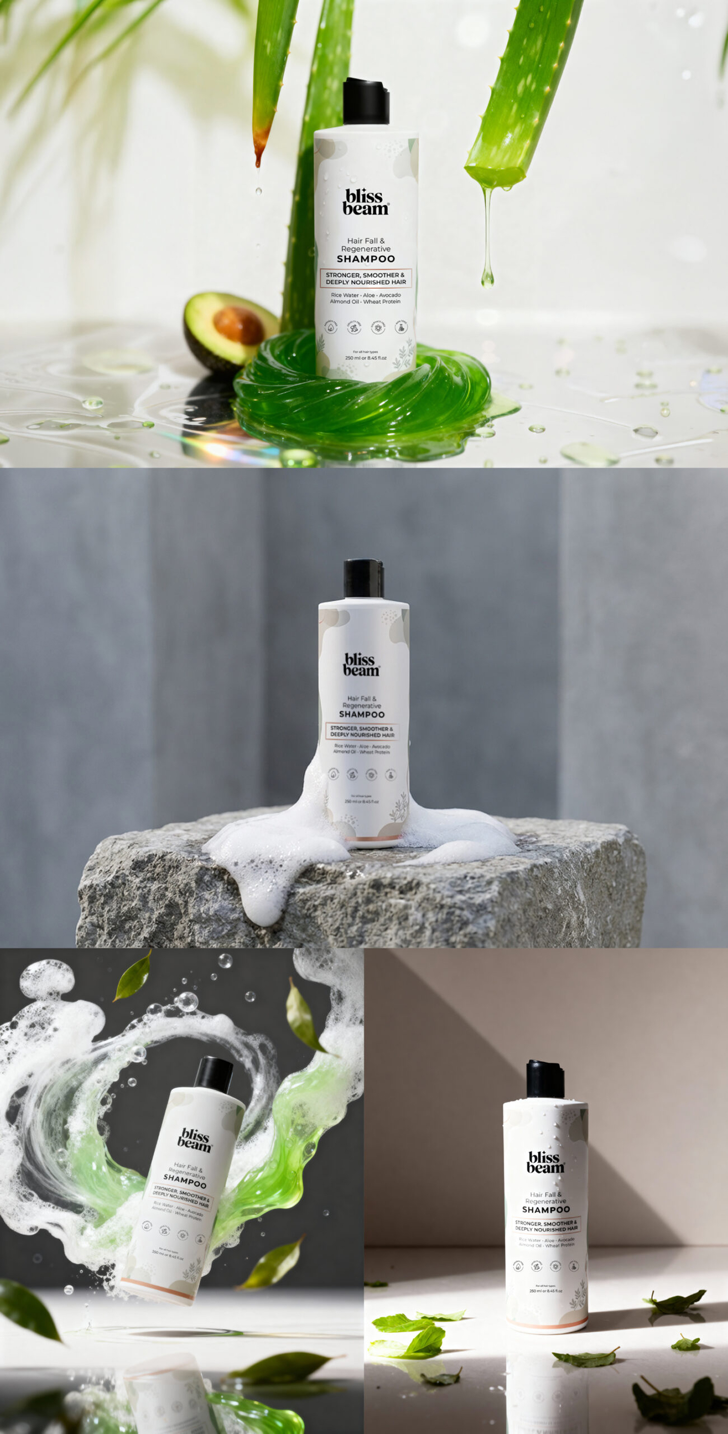
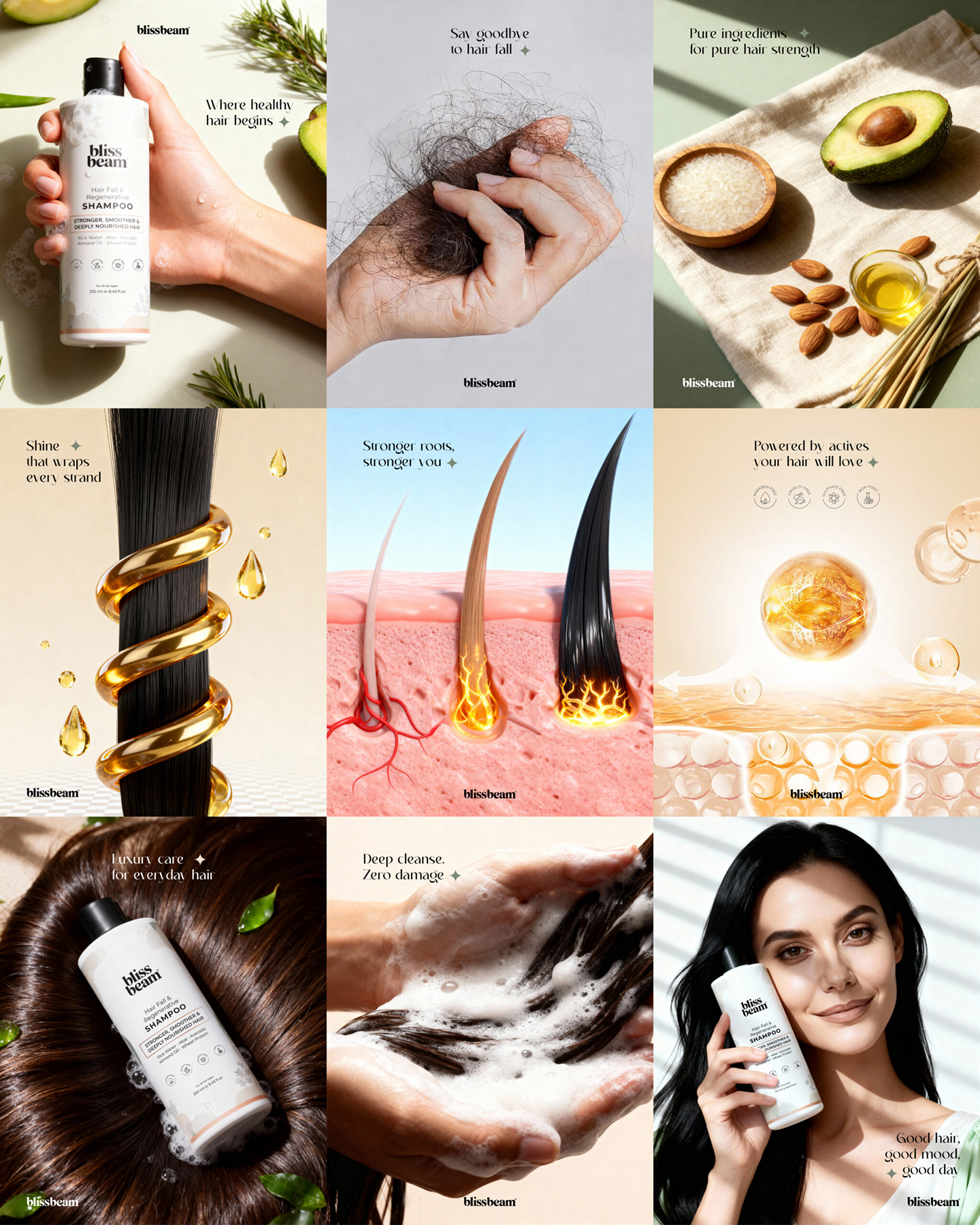
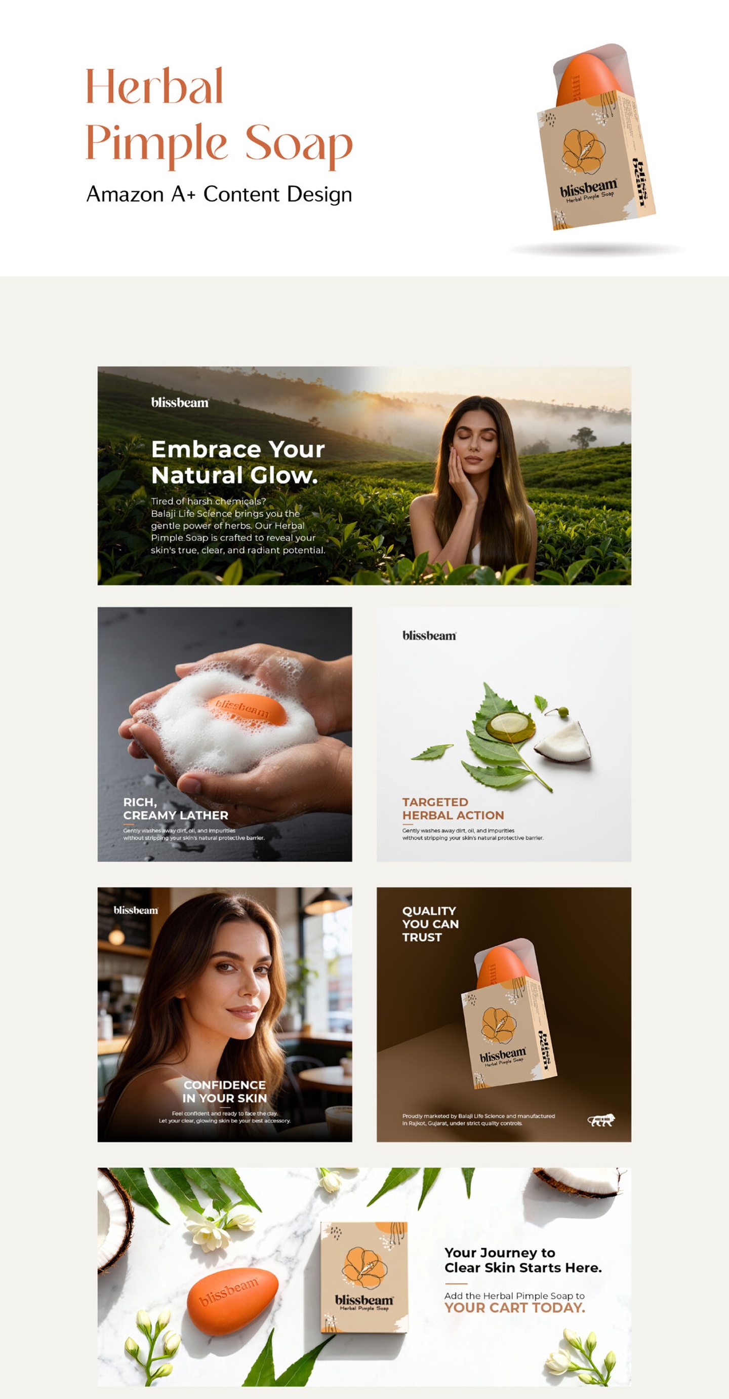
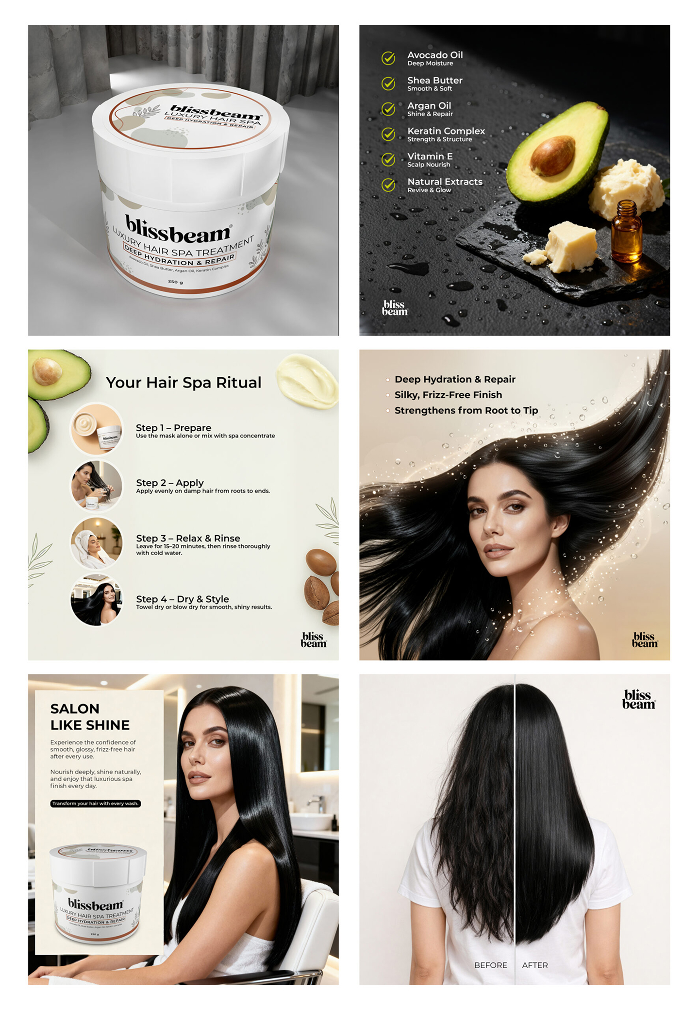
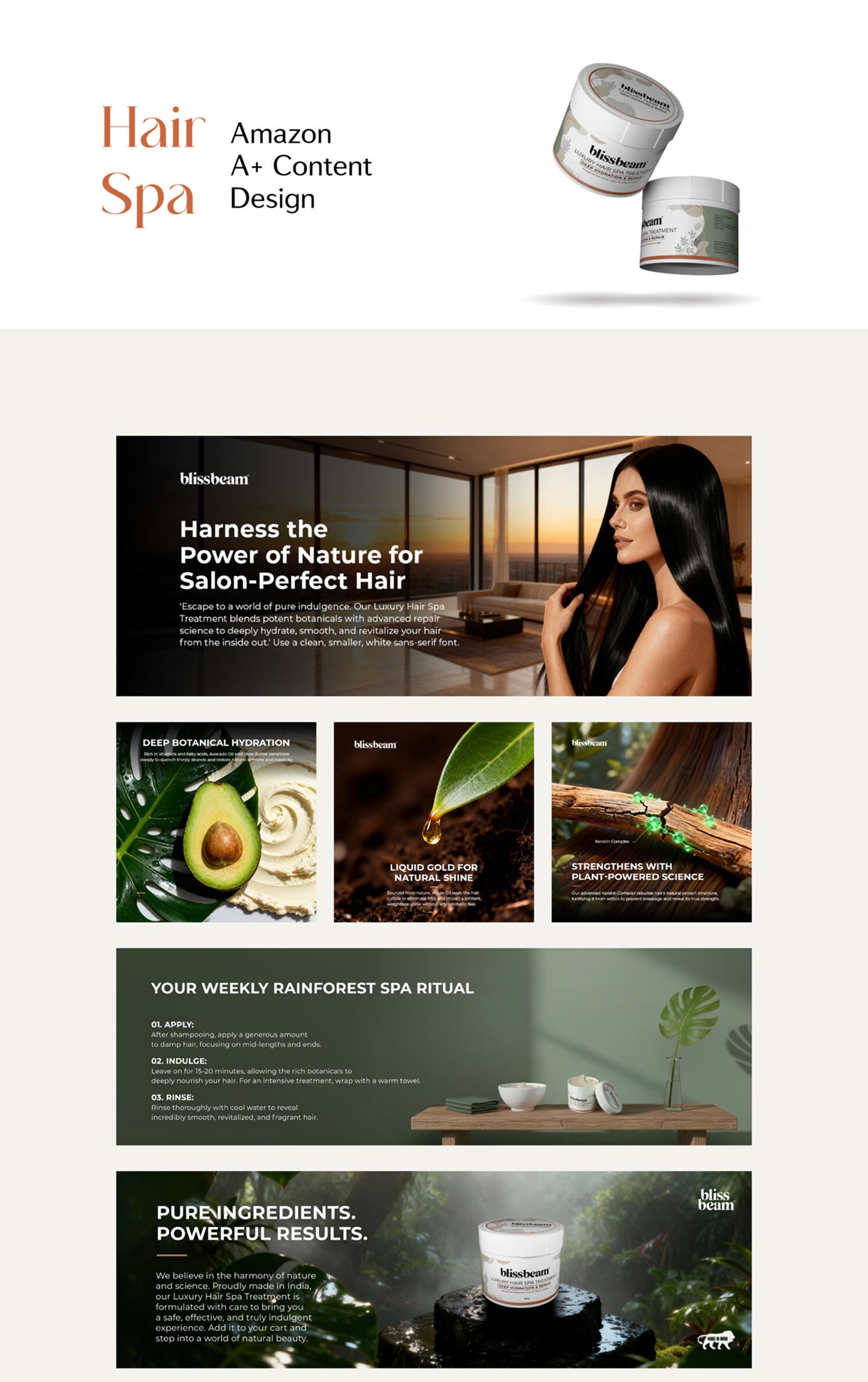
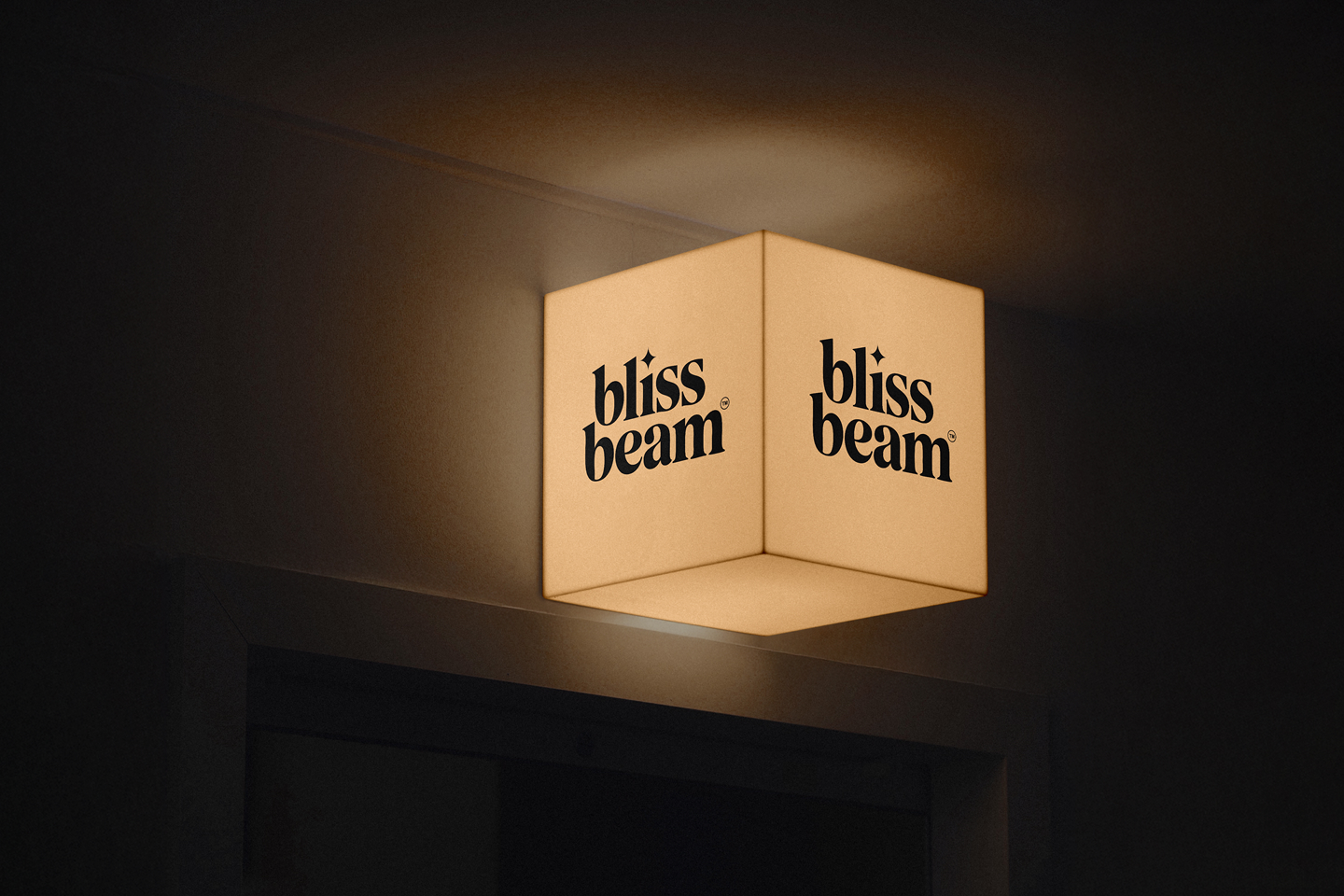
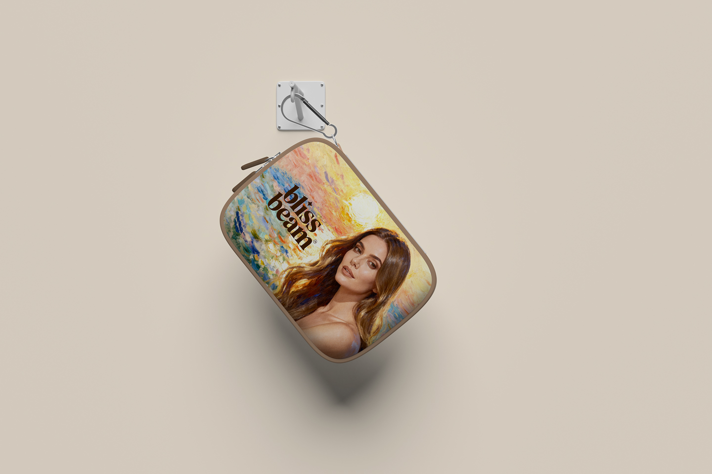
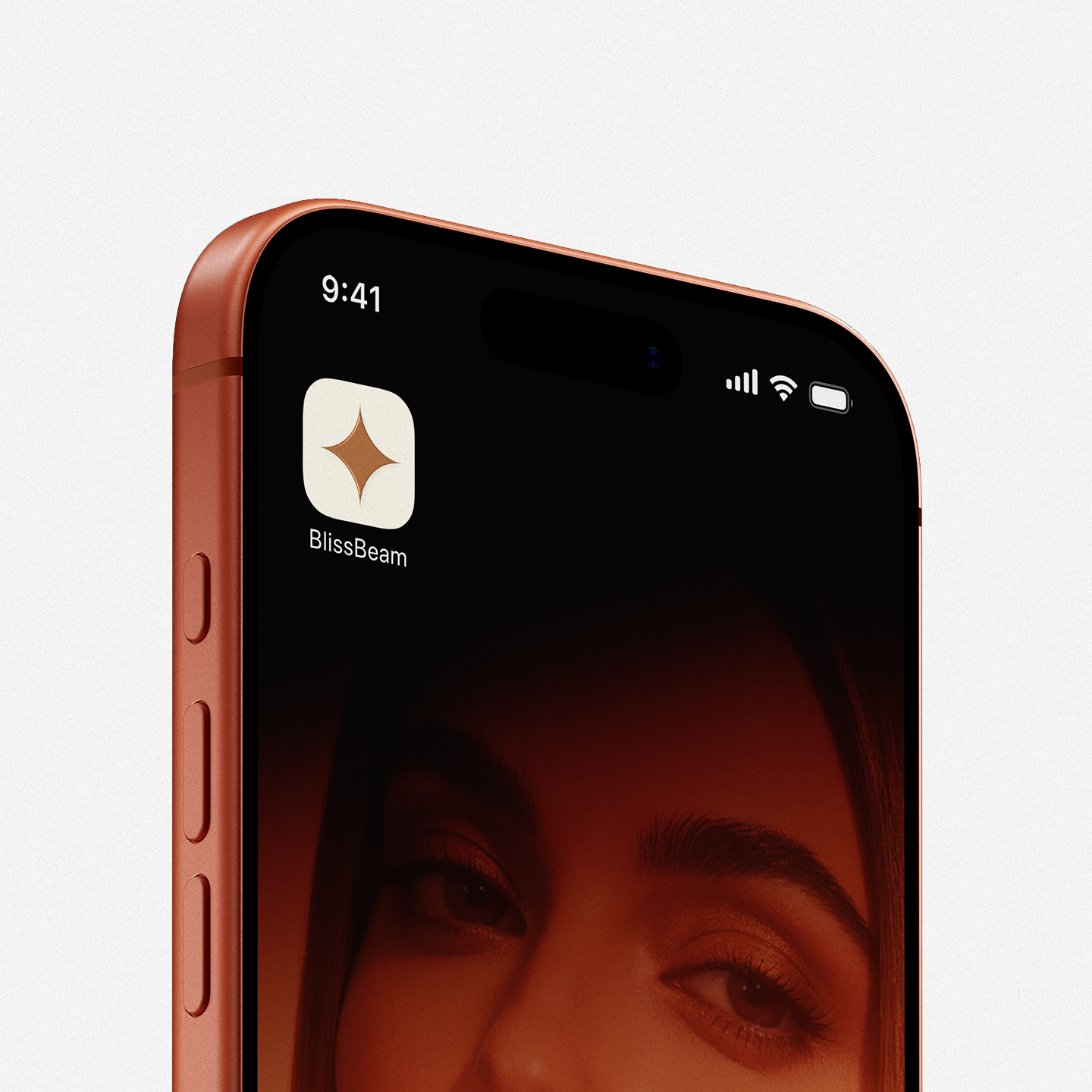
A comprehensive gallery showing all 23 design collaterals, from product bottle labels to packaging box prints, establishing a unified premium identity.
Anjali Menon
Founder, Blissbeam Skincare"The brand identity and packaging design exceeded all our expectations. It balances scientific trust with organic warmth perfectly, creating a highly premium look that has helped our retail launch succeed immensely. The minimal yet warm look is exactly what we wanted."
Portfolio Showcase
Explore Other Projects
View All Projects
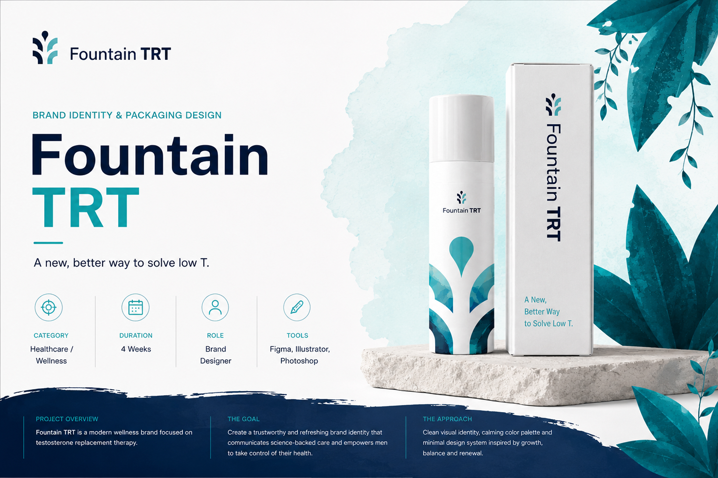
Telehealth, Web & Product Design
Website & Product Design (Fountain TRT)
Figma
UI/UX
View Case Study